
Open a DefectDojo Community Edition instance on 3.4.0 and the first thing you'll notice is that it finally looks like us.
Last week we flew a new flag. It landed on the website and the docs first. As of 3.4.0 it's in the open source product too, and Community Edition got the whole thing, not a watered-down version of it.
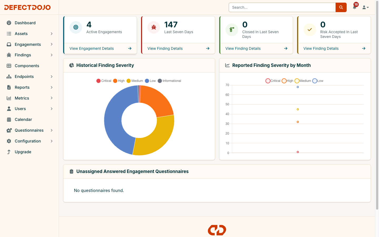
What changed
Color. Primary actions are Electric Orange. Links, focus rings, active tabs, pagination and selected rows are Dusk teal. Orange means do something. Teal means go somewhere. White cards sit on a warm off-white ground with a light sidebar and dark Midnight text, and every utility color ramp in the UI was re-tuned to the brand, so the change reaches every page without a page-by-page rewrite.
Type. Inter for the interface. JetBrains Mono for table headers, small labels and code. Headings are bold and tight.
Logos. The new wordmark in the sidebar, a new favicon, and SVG versions of all of it.
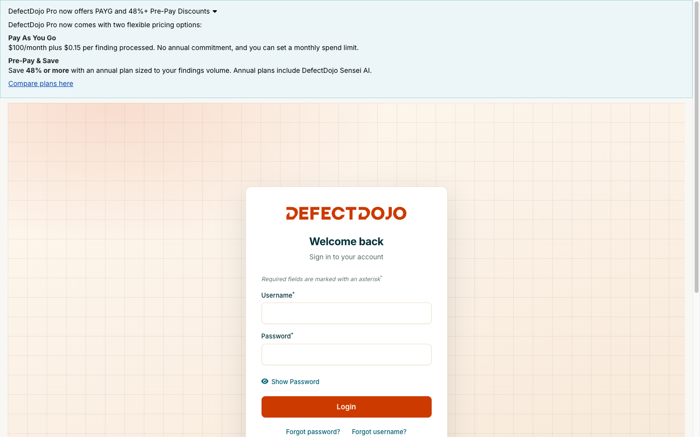
Login. A brand backdrop, the new logo, an orange sign-in button and teal links. It's the first screen most people see, and it was overdue.
Severity. Labels are now a tint with dark ink in the same hue and a matching ring. That also fixes the old white-on-yellow Medium label that failed contrast, and the asset overview counters now use the same colors as the rest of the app instead of their own. Charts and PDF report labels match.
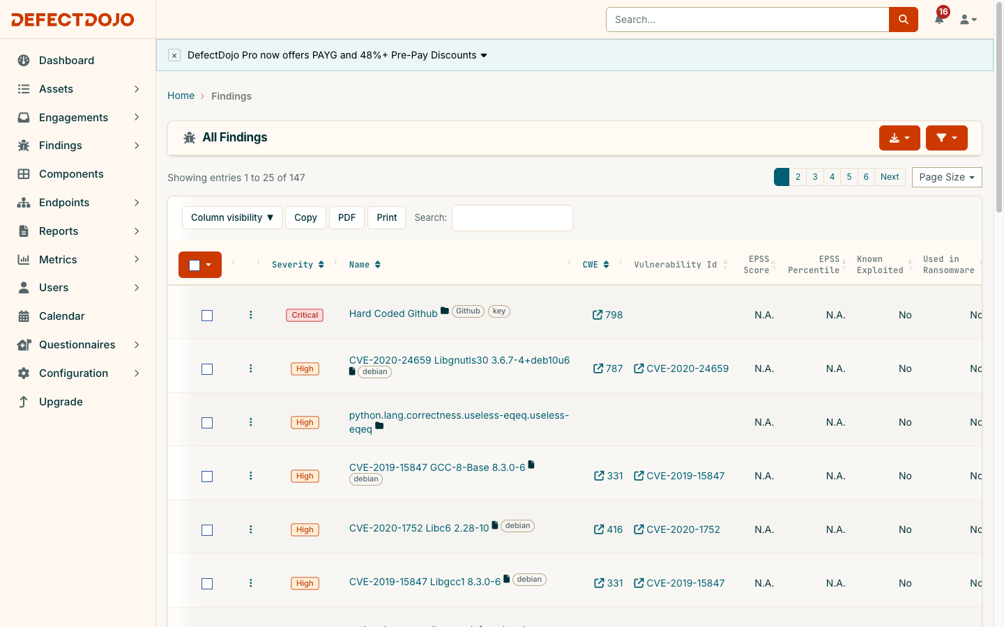
Cards, lists and dashboards. Every card sits the same distance from its neighbors. Every card heading carries an icon that matches its content. Table toolbars, paging rows and card bodies share one inset. Dashboard stat cards fill their column, so a wrapped label no longer leaves a hole under it. Tags are quiet grey chips and SLA badges use the severity treatment.
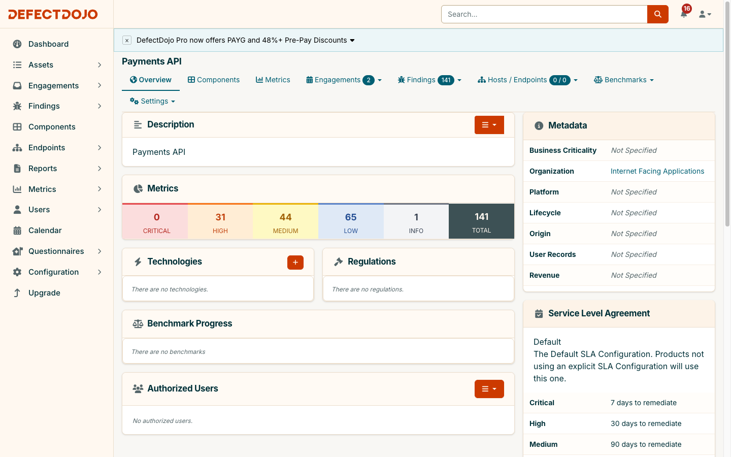
Light theme only for now, no data model changes and no Python changes. Upgrade and it's there.
Part of a bigger push
The brand refresh builds on the new interface that became the default in 3.3.0, and it lands alongside a run of Community Edition work from the last few weeks: a per-user interface language with 27 to choose from, an official Helm chart repository at charts.defectdojo.com, Compose images served through registry.defectdojo.com, an API v3 alpha, and a Code of Conduct for the project.
None of it is an accident. Community Edition is free and carries an OSI-approved license, and it is the system of record for security teams all over the world. We want it to be the best open source experience we can build. Most of our Pro customers ran Community Edition first. Plenty of teams never move past it, and that's fine with us.
Record to action
Community Edition is a system of record. Every scanner's output in one place, deduplicated, tracked and reported on.
Pro is a system of action. Sensei writes the fix and opens the pull request. The Triage Engine turns your decisions into rules. Threat intelligence, connectors, SSO and role-based access come along with it.
When you're ready to move from record to action, take a look any time. Until then, upgrade to 3.4.0 and enjoy the new paint.